Policy
on UNCDF logo


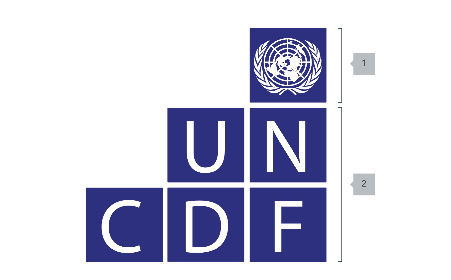
There is only one version of the logo: the ‘UNCDF’ building blocks.
HQ Units, Regional and Country Offices should use the UNCDF logo as their only logo. There should not be any separate or stand-alone logos used. There are no exceptions to this rule.
On all printed materials the UNCDF logo should be placed at the top right-hand corner on the front cover of all printed publications: magazines, reports, books, brochures, posters, flyers and exhibit displays. (In the case of Arabic language publications, the logos would be placed on the upper left corner).
When producing a publication with other partners (UN partners, government institutions, civil society organizations, private sector entities, etc.), all logos should be placed on the same line either at the bottom or at the top of the front cover of the publication. All logos should be visually equal; no one logo should take precedence over the other logos of partner agencies or organizations. There are no exceptions to this rule.
Donors should always be properly acknowledged in all UNCDF printed materials. When using a donor’s logo, high-resolution professional format of the logo should always be used (i.e. not a format downloaded from the Internet).
Logos of commercial publishing houses should be placed discreetly on the back cover of the publication, on the spine or on the inside pages of the publication.
When displayed beside the UNDP logo, UNCDF logo should be placed on the right side, with equal size as the UNDP logo, starting from the same top line and ending at the same bottom line.
Any UNCDF initiative or programme is allowed to use the so-called “sub-logo”, a combination of the UNCDF logo and the programme’s name. Sub-logos can be produced by the Partnerships, Policy and Communications Unit only, upon request.
On letterheads, the UNCDF logo is always on the right hand side of the page. This is to be applied on relevant documents and reports.
For stationery, the Graphic Standards prescribe standard typefaces for the tagline, and standard layouts with a fixed relationship between the tagline and logo elements.
There is only one version of the name: UNCDF. HQ Units, Regional and Country Offices should refer to UNCDF as the ‘UN Capital Development Fund’.
The UNCDF brand is built around the UNCDF acronym. When using the full name, it should be ‘UN Capital Development Fund’. It should not be placed directly beneath the logo.
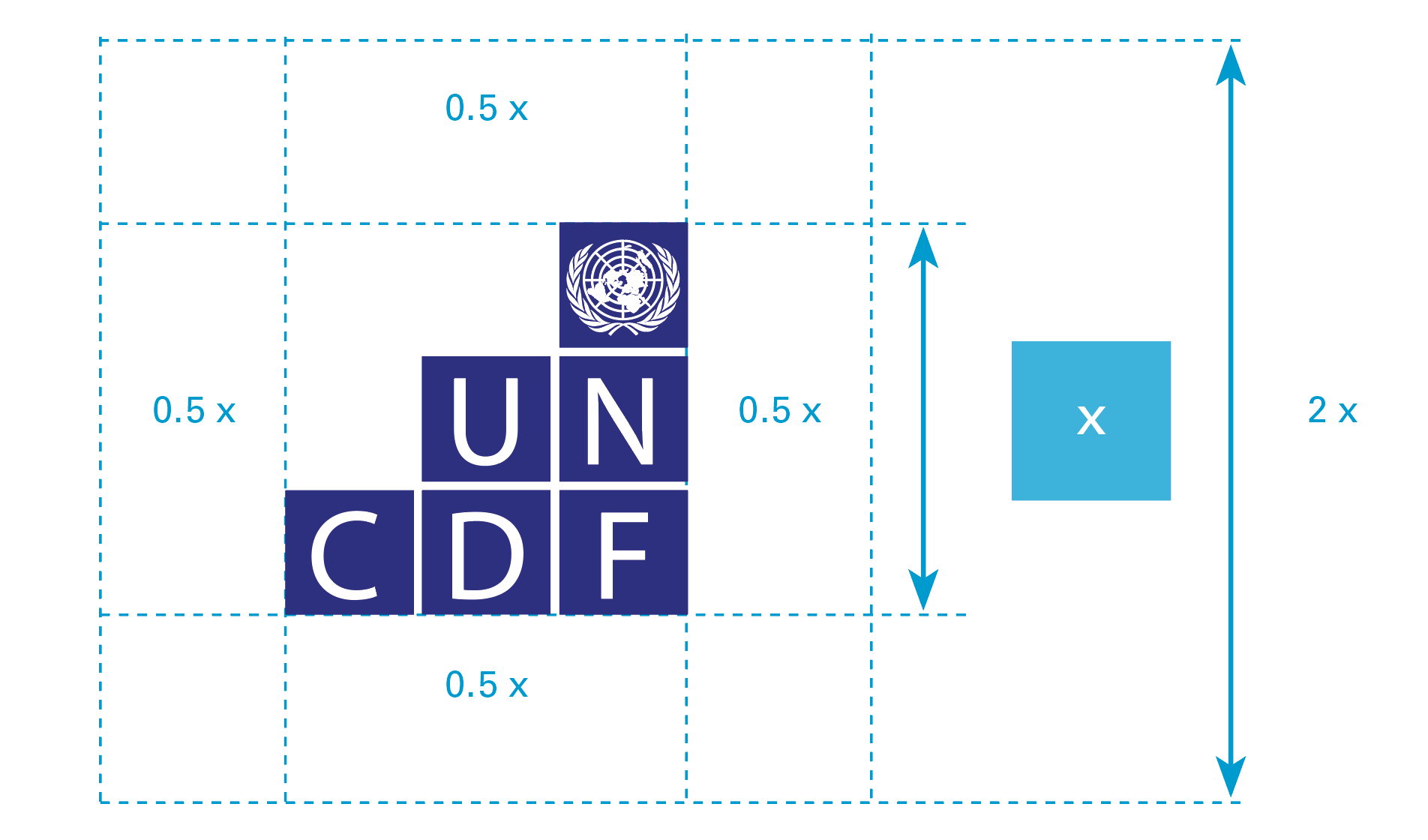
The UNCDF logo is the combination, in one fixed-size relationship, of the United Nations emblem and the letters ‘UNCDF’. The logo connects UNCDF with the United Nations more closely, while keeping it strongly in the UNDP family. It echoes the ‘building-blocks’ of UNDP’s own logo, but gives UNCDF a strong identity of our own by adopting a ‘step blocks shape’.

For darker backrounds you should use the alternative light version.
Attention: Use of any stylized, animated, hand drawn or other versions of an unofficial logo is not permitted. This undermines the logo system and brand consistency. Please consult with the Partnerships, Policy and Communications Unit if you have any questions or need further help at uncdf.ppc@uncdf.org.

